The team behind a climate postcards project discuss how they tried to make the IPCC's climate projections feel more tangible and visible to readers.
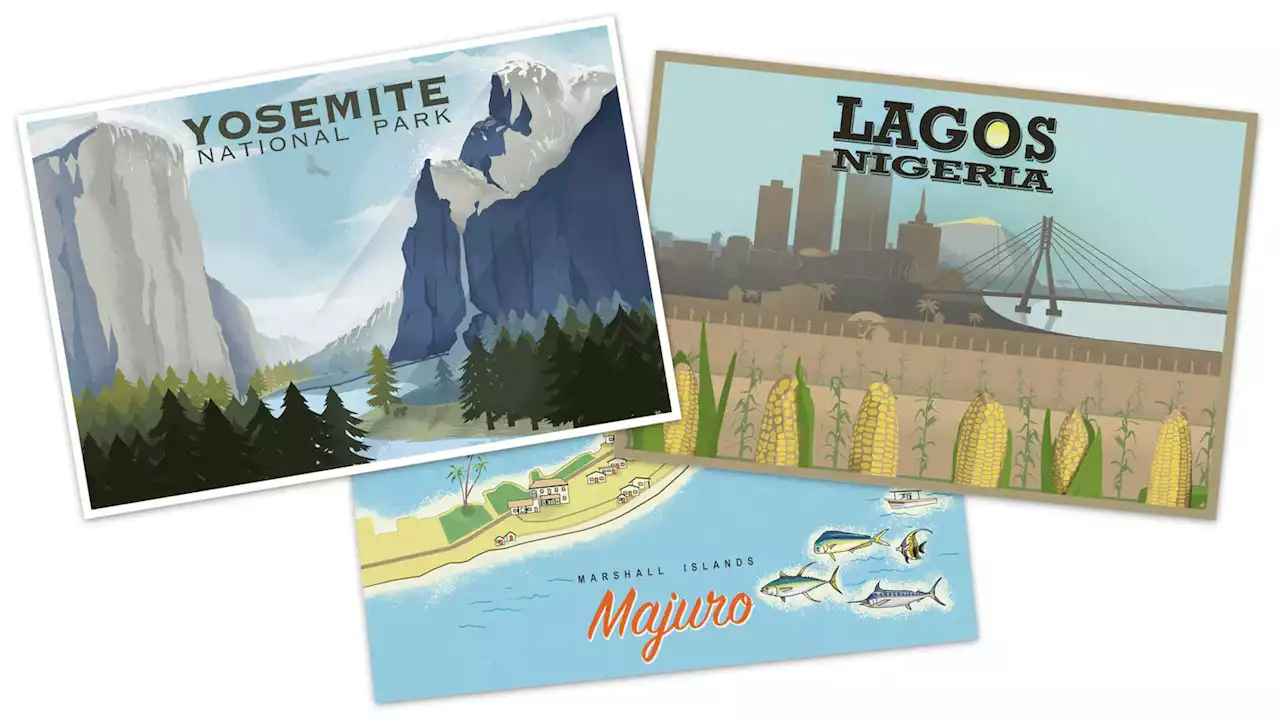
One of your goals for this project was to make some of the projections laid out in the U.N.’s climate report feel more tangible. Why those three locations, and how did you report out the scenarios for each one?We wanted to pick places that really represented the stark projections that are in this report — places that felt like they represent both the scale of the suffering that could happen by the year 2100 if we don’t do anything, as well as what can be saved if we take action.
We chose Yosemite because we wanted to talk about biodiversity, wilderness and the effects on nature. Yosemite is such an iconic place. The image of Yosemite Valley with the Half Dome, that’s an image that many American readers are familiar with, and so seeing that image change under the different scenarios will hit home in an emotional way.
Lagos is projected to become the most populous city in the world by 2100. If you read the IPCC report, it’s quite clear that African countries are going to experience some of the worst impacts from climate change, even though they have contributed the least to emissions — less than 3 percent of global emissions come from Africa.
The future of the Marshall Islands is really entirely contingent on limiting warming as much as possible because a world that warms two and a half or three degrees Celsius, which is the path we’re on, life is potentially no longer even possible in the Marshall Islands and other small island states. For such a small country, they play a huge role in international climate negotiations, and they’re very vocal, especially in the development of the Paris agreement.